Many of us have heard photography described as ‘painting with light’. But there’s a flip side. Great art tells great stories not just through what it illuminates – but also what it leaves in the dark.
At a basic level, shadows are used to create depth, dimension and texture in an flat image, leading the eye and emphasising (de-emphasising) different elements. But – for the right project – they can do so much more.
Shadows can be used in poster design to add mystery (it’s especially effective for easter eggs), forge powerful emotional resonance and reveal unexpected connections. It can tease nostalgia or hint at plot points without necessarily giving the game away. And it’s a powerful visual counterpoint to flashy and colourful imagery.
In this article, I’ll examine how shadows and shade can be used effectively in poster design and take a look at some striking examples.
Something’s Missing
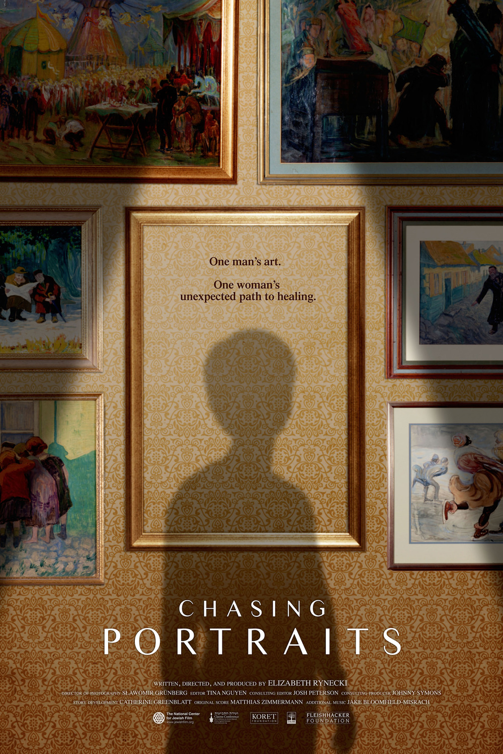
Shadows in the place of more traditional imagery can bring a poignant sense of loss and absence. Chasing Portraits is a deeply personal documentary about one woman’s quest to recover her great grandfather’s art, years after he was murdered during the Holocaust. The shadow cast on an empty frame movingly conveys the absence of both the man and his work, but also a continued presence in the life of his family.

True Identity
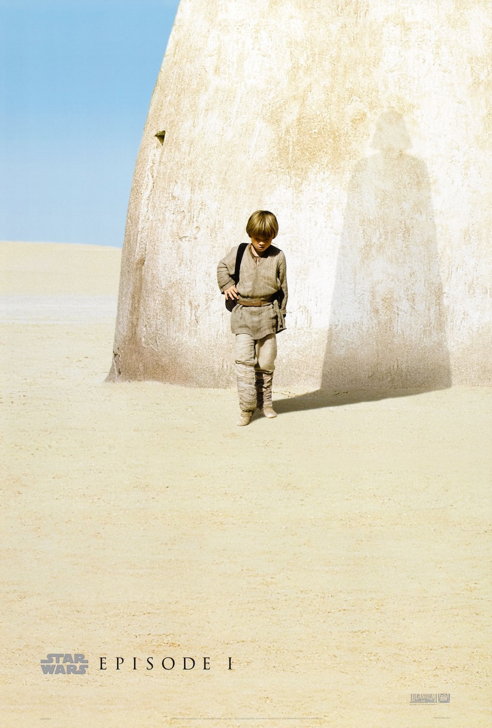
Visually and narratively, shadows often reveal truth. This can even be something that a character is unaware of – for instance, in the now-famous teaser for Star Wars: Episode One – the innocent figure of young Anakin casts the shadow of a much more sinister figure: Darth Vader. This emphasises the sense of dramatic irony for the audience as we’ve ‘seen the future’ and know that Anakin cannot escape this fate.

Poster by New Wave Creative
Flash-Forward
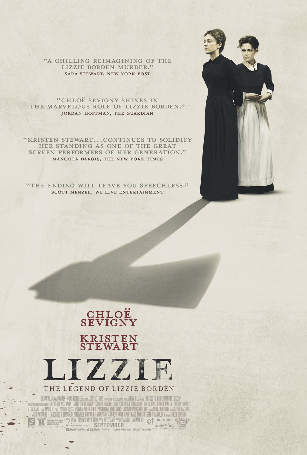
In a similar way that a shadow can express who someone will become, shadows can also suggest what someone will do. The poster for Lizzie teases the actions of history’s most famous axe murderer and also hints on who that axe may fall. This stark monochromatic design choice aptly channels the tension of the narrative, because the audience knows right from the beginning that it’s not if a murder happens, it’s when.

In the Dark
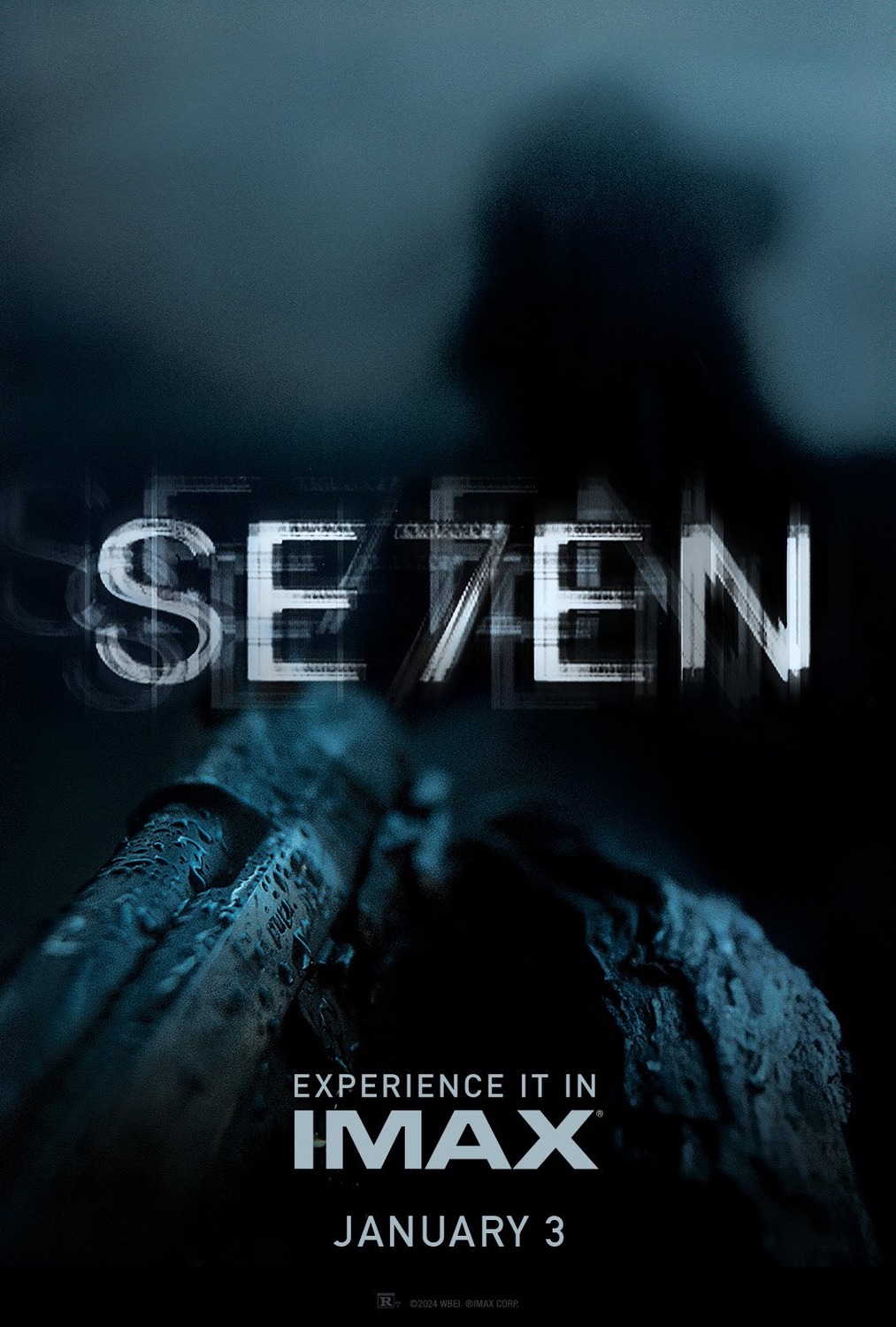
Horror and thriller films often thrive on what can’t be seen – the same is true of their posters. Shadowy designs give the audience just enough info to let them fill in some scary blanks! This can be done subtly, for instance by casting dark shadows on a character’s face to make their expression, intention and state of mind difficult to read or much more overtly, by throwing an entire figure into shadow. Either way, from a psychological standpoint – we feel uneasy!

These are just a few of the ways that shadows can be used in poster design to tell a compelling story. How do you feel about this lights out approach to film posters? Did I miss any of your favourites? Let me know in the comments!
For poster and graphic design services for your latest TV or film project, drop me a line at adam@strelka.co.uk.


