When talking about my job, I get a lot of questions about how exactly a project is developed. Of course, there are always some differences – but in this article I’ll break down a typical key art brief from start to finish, to give you a feel for my particular process and what I feel works.
When starting any project, I start with a chat with the client. This is an opportunity for them to tell me about what sort of thing they’re looking for, and if there’s anything they need to get across or focus on. The series Recipes for Love & Murder fits neatly into the ‘cosy crime/mystery’ sub genre, mixing home cooking with amateur sleuthing, so it was important to convey that ‘cosiness’ with a hint of danger.
There were also key characters who needed to be included. Maria, the main character, of course needed to feature prominently but there were also key secondary characters that the client wanted to feature. Early on, we decided this would likely result in two versions – one with Maria on her own, and another featuring the rest of the cast alongside her.
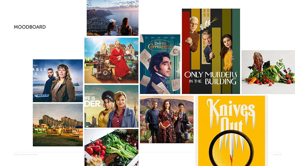
Moodboard
Once the general brief had been laid out the next step was to bring together a moodboard. This establishes a feel for the look and tone that we’d agreed we’d want the key art to channel. For Recipes for Love & Murder – this was bright, bold and eye-catching.
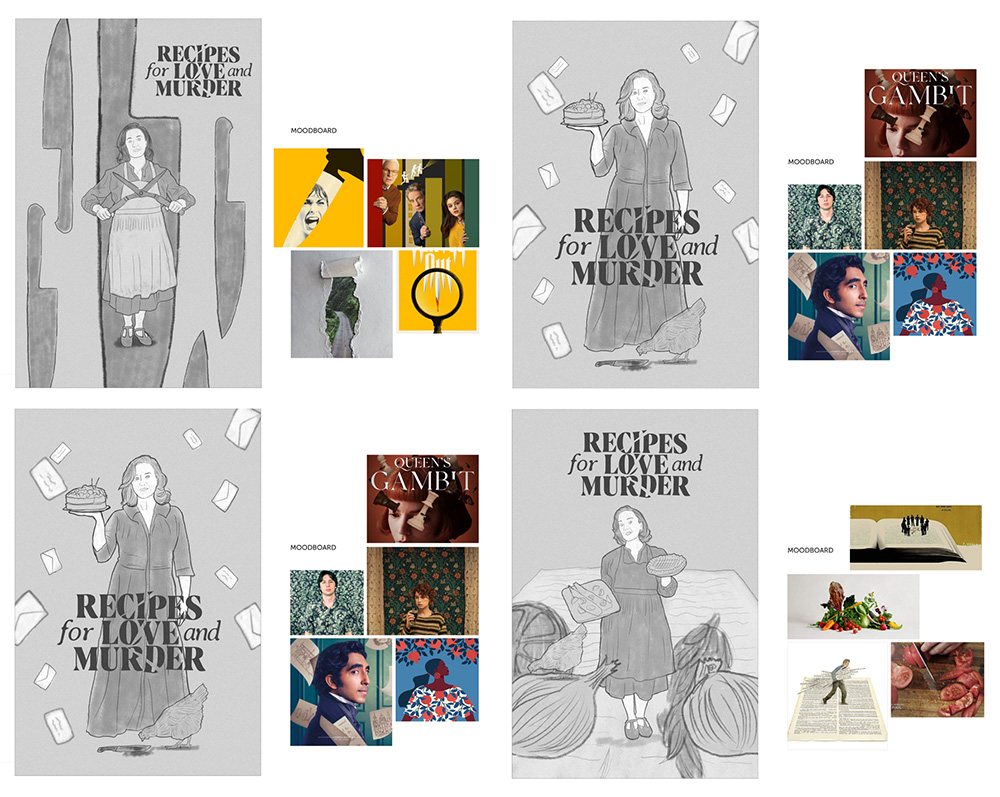
Sketches
The client was really happy with the vibe of the moodboard, so at this point, I put together a selection of black and white sketches to showcase possible design routes. On this project, I already had access to still photography of the cast that had been taken during production. This meant I had a good idea about the imagery I’d be working with so I could factor that into the design ideas. That’s not always the case!
First Design Pass
I then had a discussion with the client to see which option they wanted to develop. This is normally a backwards and forwards conversation where we discuss the pros and cons of each concept. Ultimately, we decided to progress the option with the falling letters as this spoke well to the themes of the show (the main character is a local newspaper agony aunt), and visually added an element of chaos and mild peril. Following that, I went away to put together the first draft of the full design.
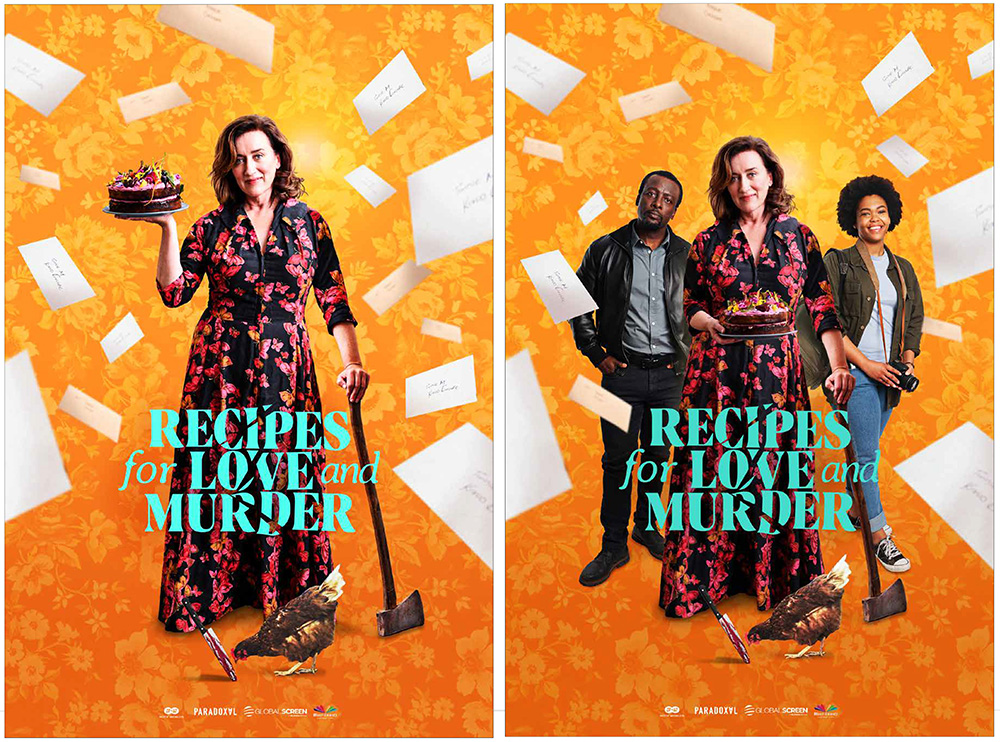
First Round Amends
These went down well with the client, but – as is usually the case – they had a few notes. On reflection, they felt the image I’d used was too similar to the outfit and pose used on promo material for season one – so we ended up swapping the talent photography. They also wanted to lean more into the strong background pattern I’d used in the mood board, using it as a way to introduce a few elements from the show within it. All this led to the next pass of the design – for which I produced a range of quick options on different backgrounds, to see what would work best.
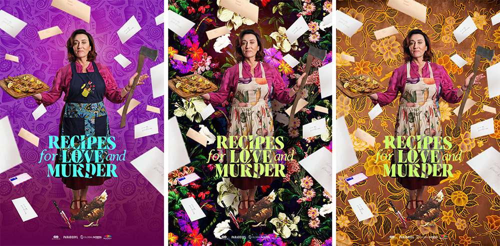
Second Round Amends
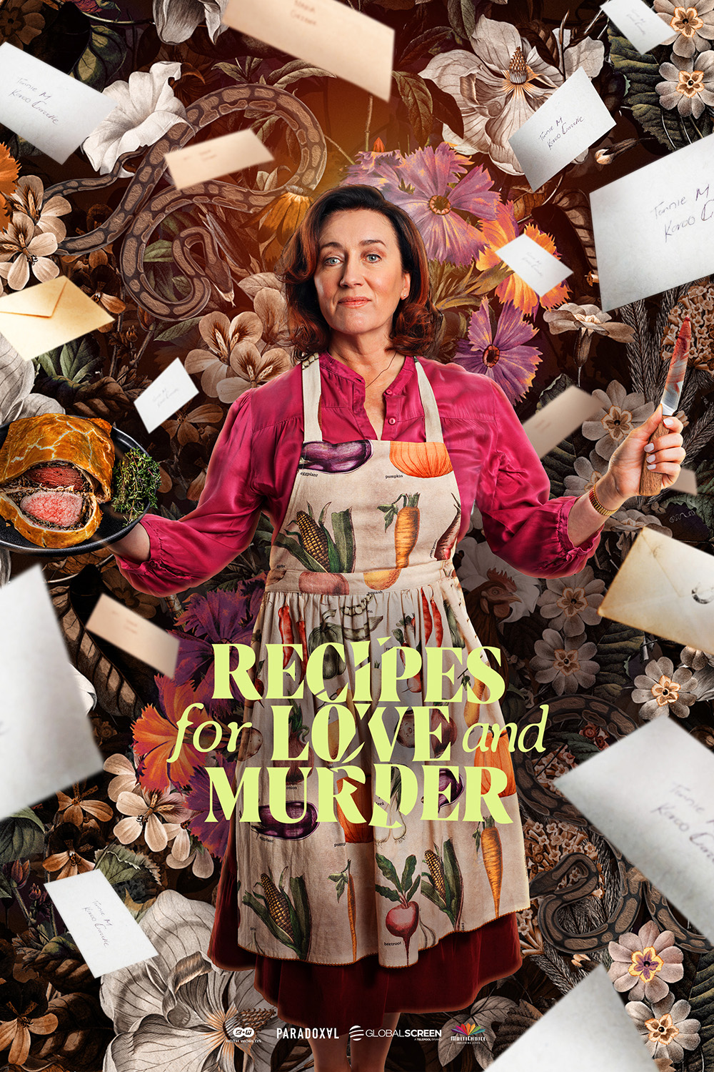
The client liked the second option best, but it needed some work to balance the talent against the background as she was getting a bit lost. We also swapped out the items she was holding – the board of fish for a beef wellington, and the axe for a knife. And sadly (!) the chicken was dropped as she was getting a bit lost too!
Third Round Amends
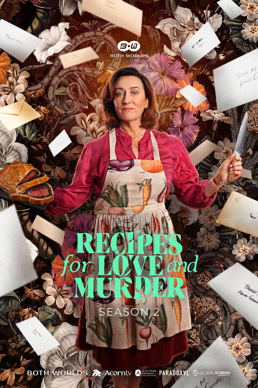
Then it was just a case of brightening some of the colours and adding a few little details to the background to incorporate elements of the story. Plenty of snakes, and the chicken made it back in too! We also changed the knife to remove the blood – this one had gone backwards and forwards a few times but ultimately the decision was without is better.
Creating Final Deliverables
Once the final design was signed off, all that was left to do was to roll out the two primary formats, landscape and portrait.


And that’s it! Are there any similarities or differences to the way you work? I’d love to hear them! If you’d like to know more about the way I work, or you’re looking for key art for a future project, feel free to reach out.
For poster and graphic design services for your latest TV or film project, drop me a line at adam@strelka.co.uk.


