I’m a big fan of minimalist poster design. Its simplicity, focus and use of negative space often make these posters a powerful choice to draw attention and provoke a sense of suspense and excitement for a project. However, as with everything in design, sometimes going against all the ‘rules’ will have you on to a winner. In this article, I will explore six more elaborate film and TV posters to analyse just why they work so well.
Da 5 Bloods
This is the poster that inspired this article. On paper, it just doesn’t work – the sheer amount of imagery, the WIDE colour palette, the uneven shapes. But it does. The competing elements convey the chaos of the Vietnam war setting and the various imagery depicting protesters juxtaposed with soldiers has a strong emotive quality as well as the bombs with Nixon’s face on them that lend a satirical edge. The psychedelic colours of the background evoke the time period and the quality of the patterning is reminiscent of blood under a microscope – eliciting a strong visceral reaction. More of an experience than a poster!
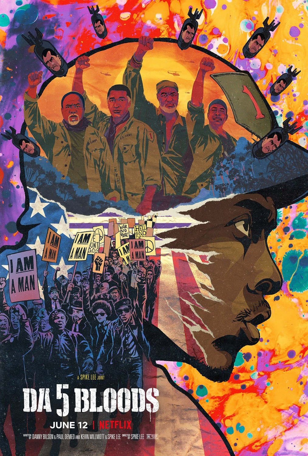
Da 5 Bloods poster by GRAVILLIS
Everything Everywhere All At Once
Given its title – this one shouldn’t come as too much of a surprise! This poster perfectly captures what a hybrid of styles, elements and tones this film was – whilst firmly keeping its protagonist Evelyn at the centre of its universe. There are so many fun elements to spot that you can keep looking at it for ages – but the design is also unified by its circular elements – which also reflect the repeating nature of the narrative.
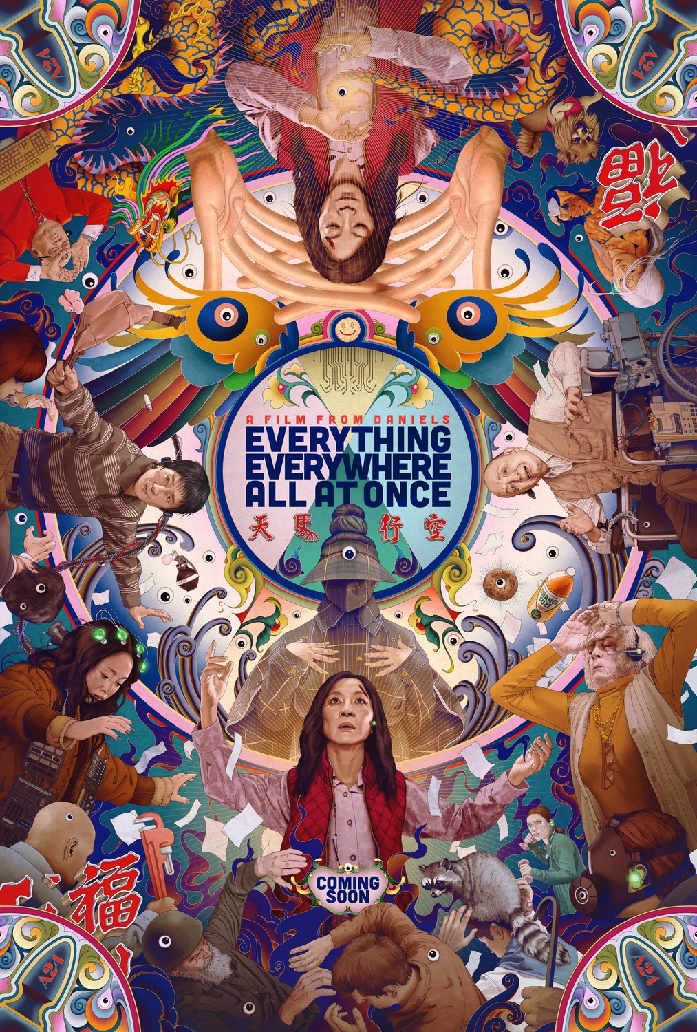
Everything Everywhere All At Once poster by AV Print / James Jean
Archenemy
There’s a lot to look at here and a lot of layering in the elements but a strong and simple colour palette help keep this one focused. The duality of the two main colours is a theme pulled through the rest of the design – with the two different sides of the main character in his different environments and the sketchy graphic style conveys both the comic book feel of the adventure and its grittier facets.
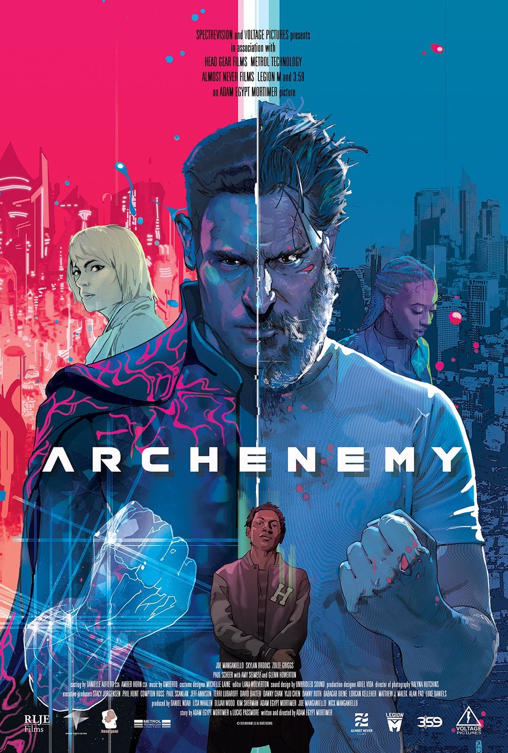
Archenemy poster
The Underground Railroad
Many faces on a poster often indicate a lot of jostling for status and billing amongst the many stars on a project – cue designers of superhero film posters everywhere trying to beautifully and creatively fit nearly all the characters in! Despite the many faces, The Underground Railroad doesn’t feel like this though. The many faces and figures in different poses and with different attitudes are a reflection of the many lives and stories that make up this part of history – as well as also representing the literal railroad network in the show. The ‘painted’ texture of the poster stops it feeling ‘glossy’ and lends a feeling of a historical story being told.
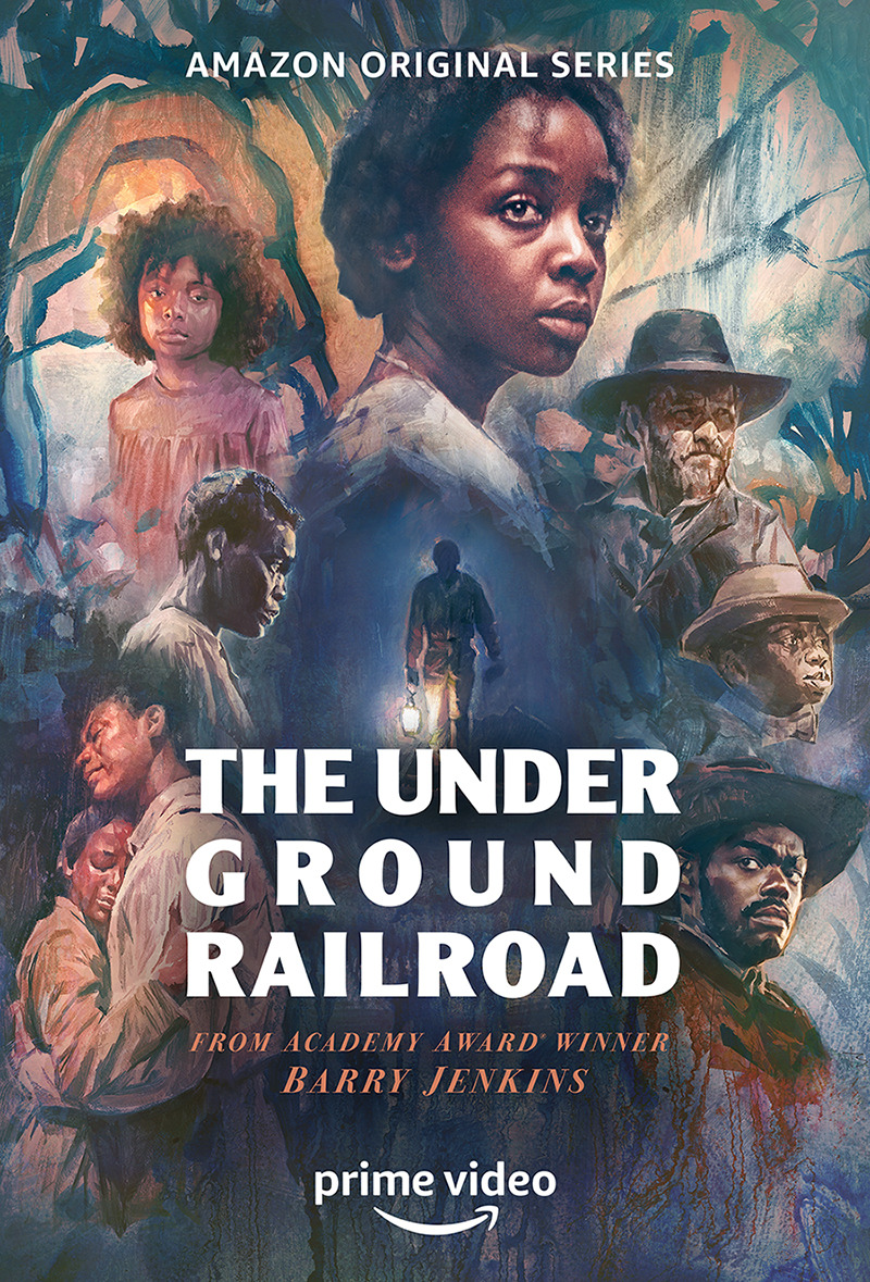
The Underground Railroad poster
Stranger Things
I probably could have featured a poster from any of the seasons of Stranger Things here. Their posters lean fully into the 80s style and feel like they easily could be an illustration of a YA novel from the time (they always make me think of the ‘Choose Your Own Adventure’ series). But I particularly love this one which is complex without showing any of the (human) characters in any detail. Through a map of the town, we are reminded of so many key moments from the show – a perfect way to lean into the nostalgic element of Stranger Things and build anticipation for what is to come! The classic colour palette of contrasting red and blue ties this one together – even without the title, it’s very clear what this is for.
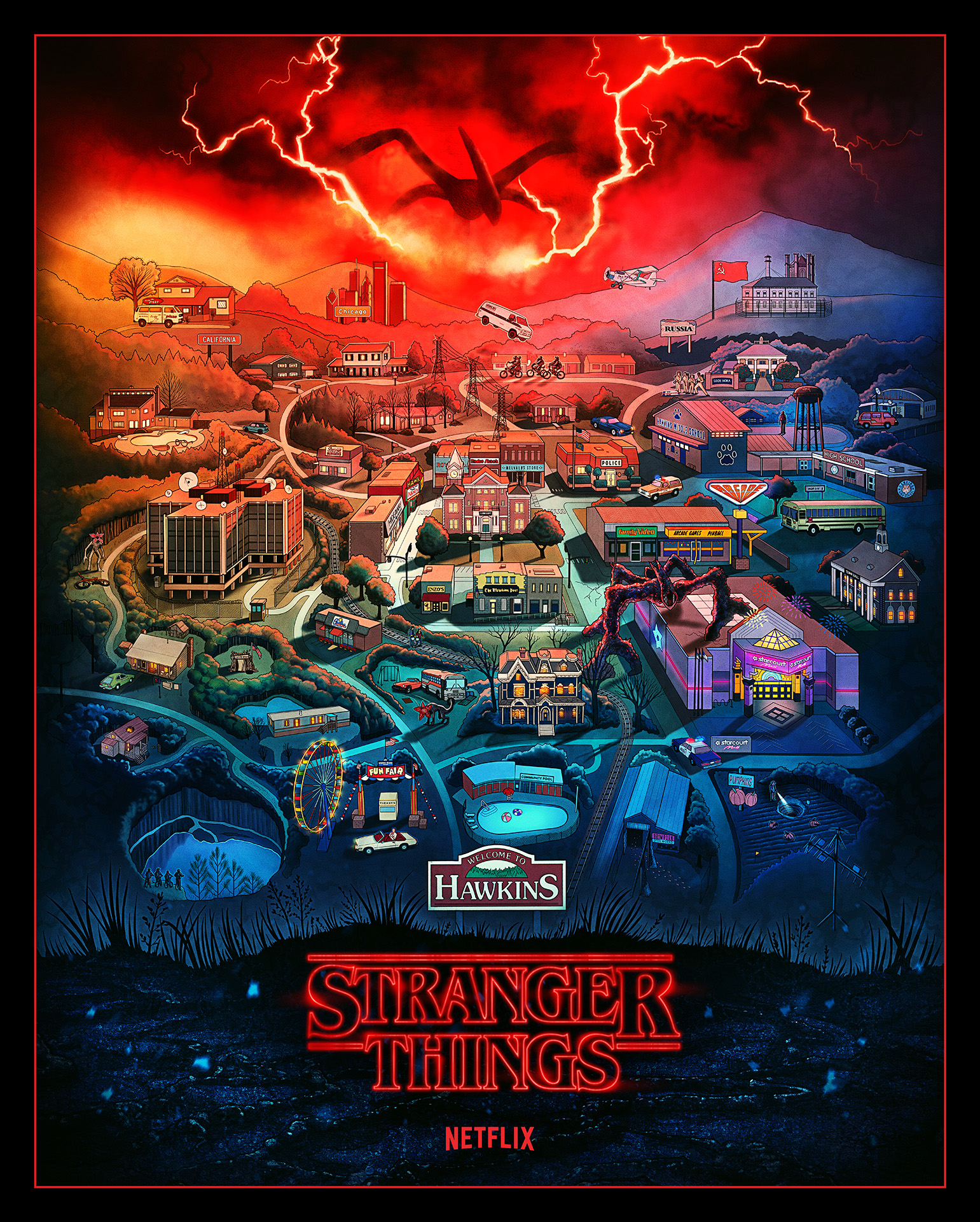
Stranger Things poster by Kyle Lambert
Great Expectations
There’s actually (a bit of) negative space here! Still, the cracked yellow walls of the background feel very minimal in comparison with Olivia Colman’s bird’s nest of hair overladen with aspects of the story. The various elements enrich the design whilst also reflecting the extent to which Miss Havisham is weighed down by her past. Judicious use of colour and light helps keep our focus on the three characters and the overall effect is creepy and intriguing.
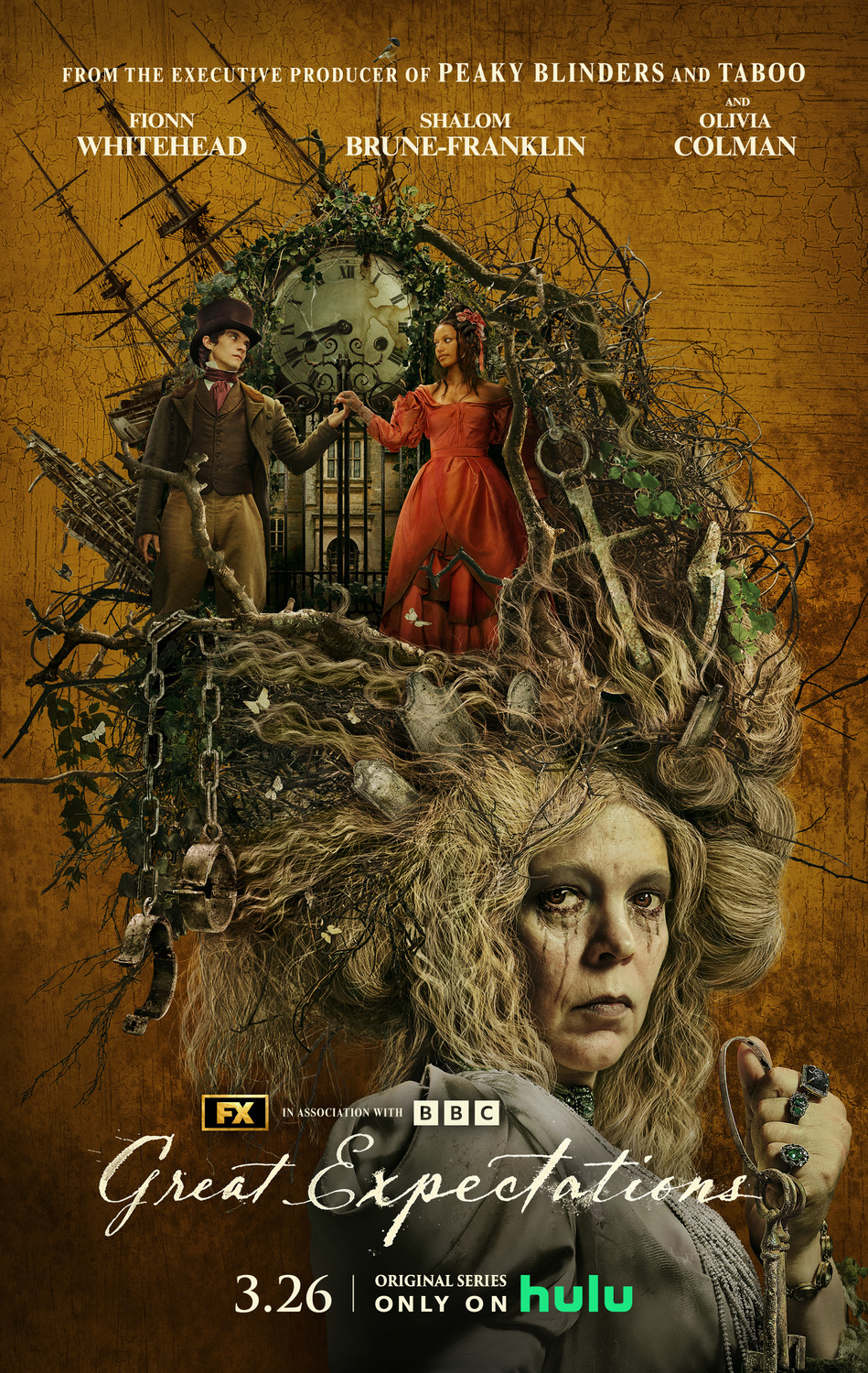
Great Expectation poster by AV Print
So while minimalistic design has become one of the most popular trends in modern marketing, these intricate posters stand as a counterpoint – demonstrating that when they reflect and support the story being told – a complex design can be just as or sometimes even more effective at captivating an audience.
I’ve found these elaborate poster designs really inspiring, reminding me that there really is no singular formula for creating powerful work. What do you think of complicated posters? Are there any you love that I’ve missed? Let me know in the comments!
For poster and graphic design services for your latest TV or film project, drop me a line at adam@strelka.co.uk.


